ONE UP
"BUILT FOR IMPACT.
DESIGNED TO PERFORM."
URBAN-INDUSTRIAL STYLE
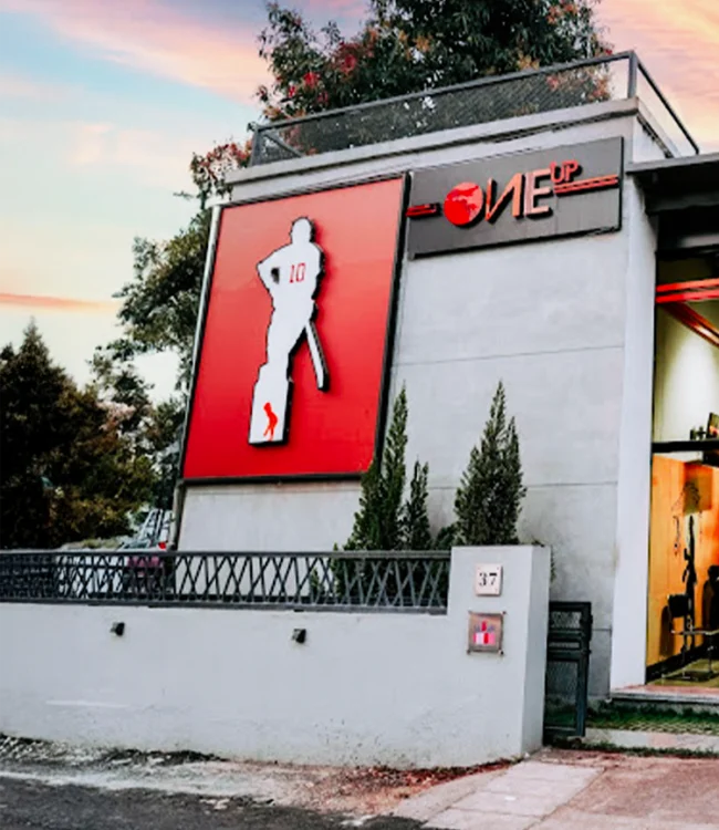
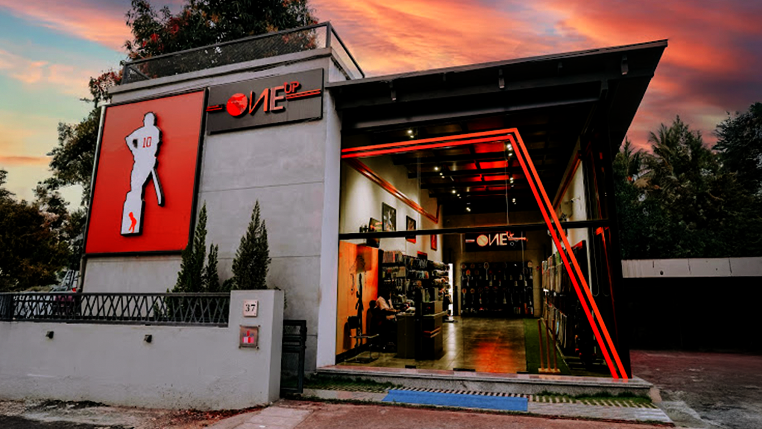
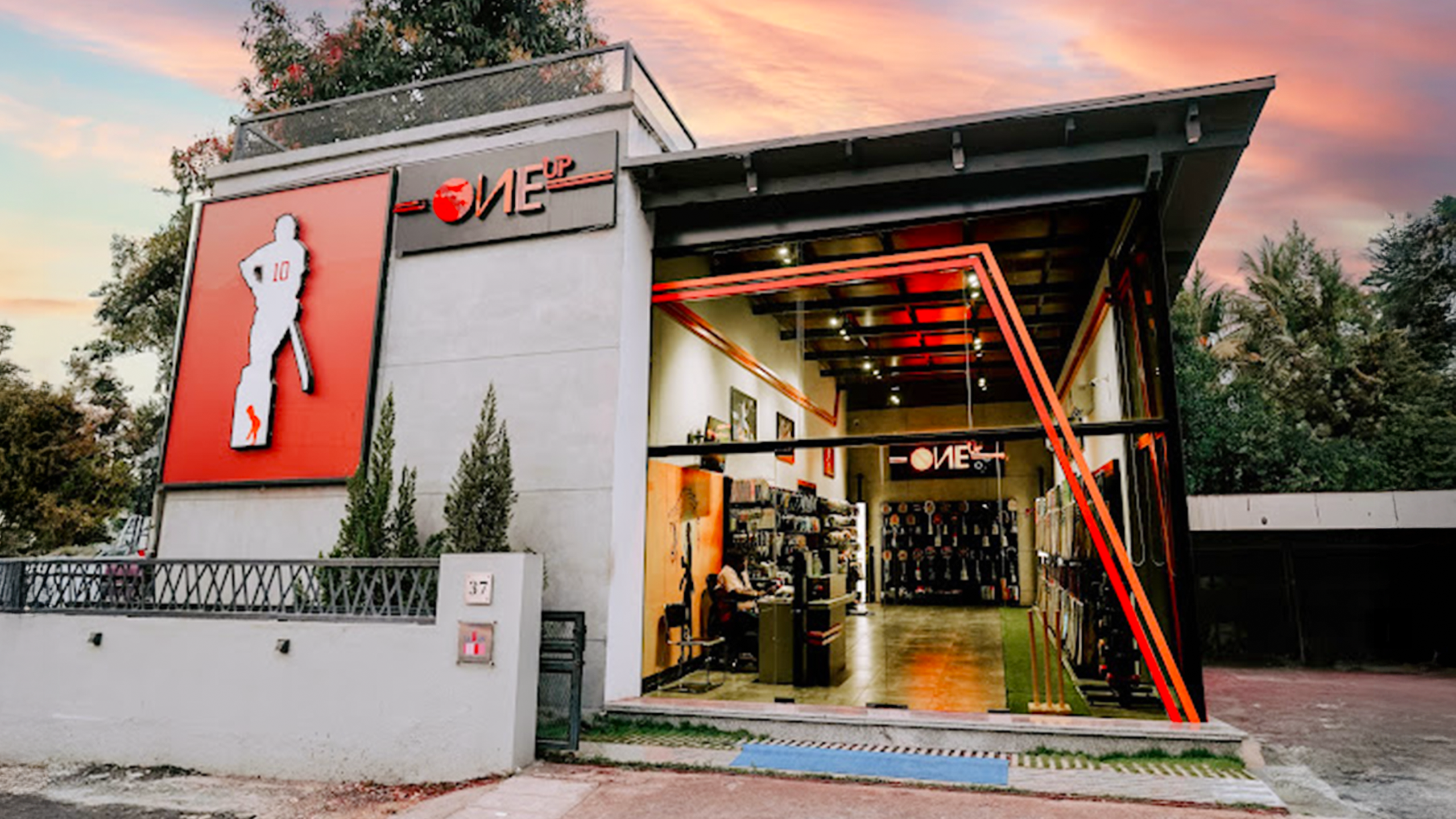
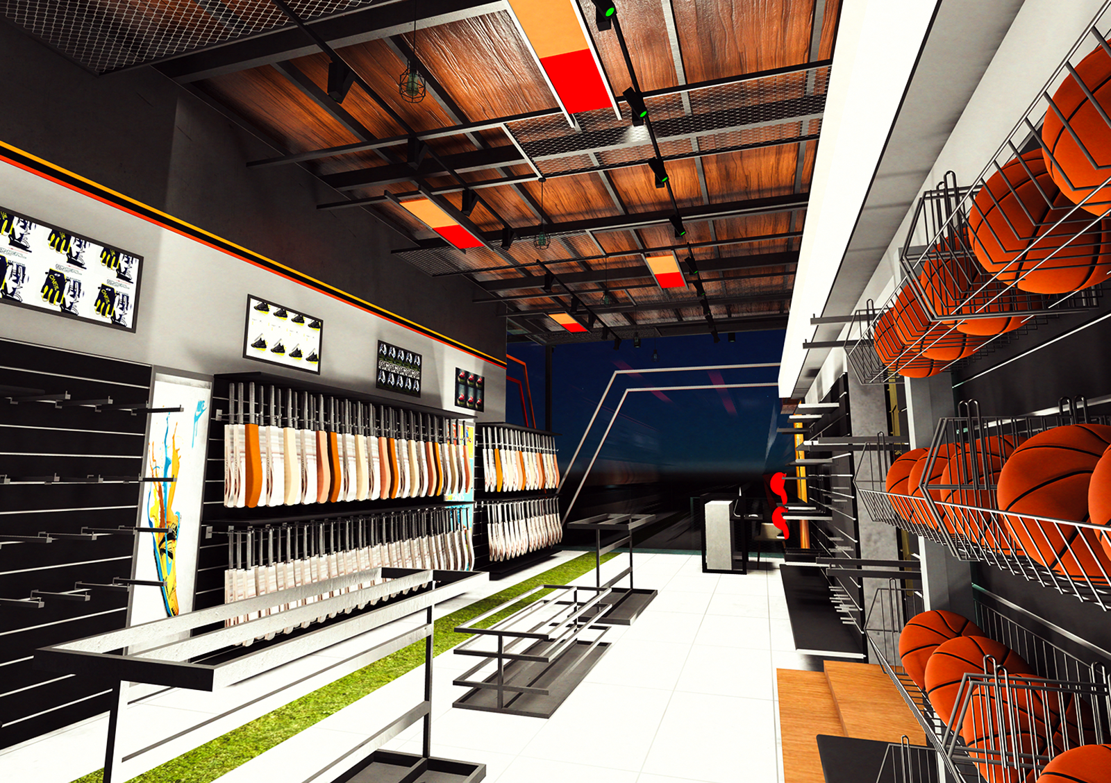
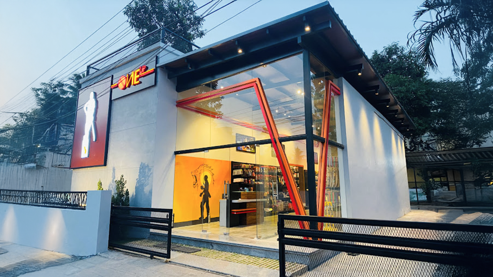
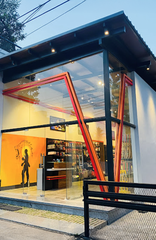
A raw, edgy visual language with exposed concrete, blackened steel, and glass. The structure speaks with bold angles, tough textures, and modern motion.
STEEL & GEOMETRY
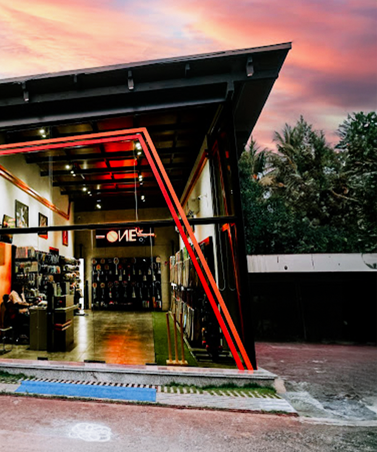
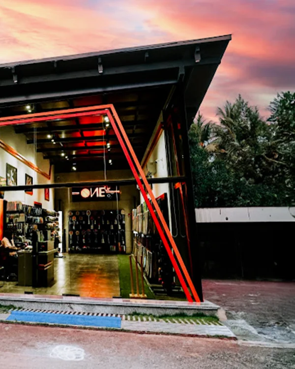
Exposed steel frames and dynamic geometry mirror the strength and energy of the brand. Angular forms give the building a distinctive silhouette.
SPORT-CENTRIC FAÇADE
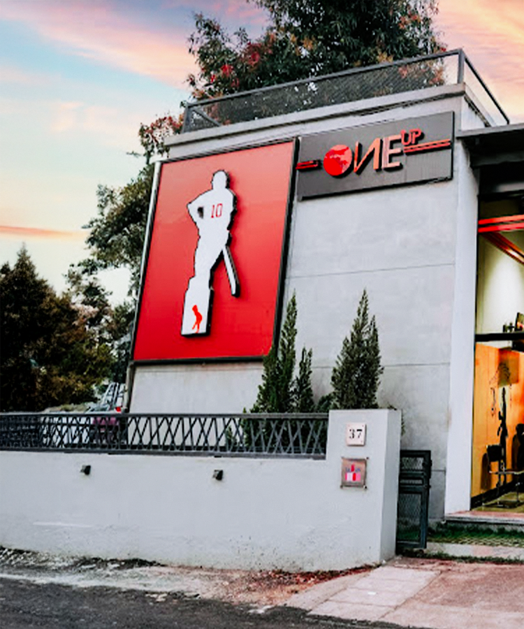
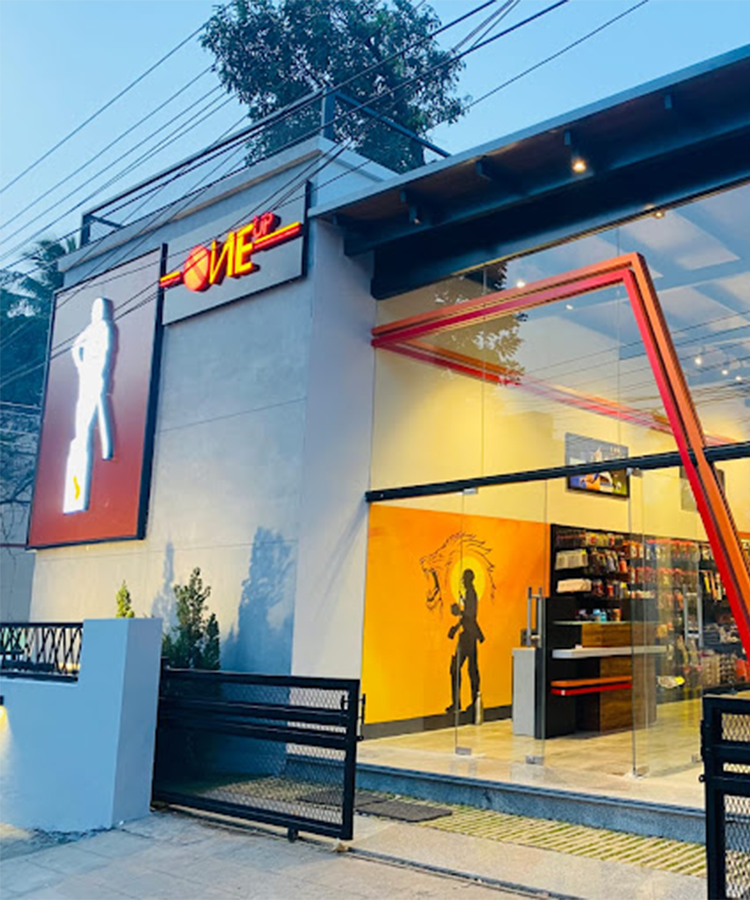
The backlit branding panel with a cricketer silhouette and number “10” creates a strong identity — linking the architecture directly to performance and aspiration.
OVERVIEW
01
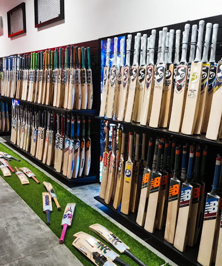
Located in Chrompet, Chennai, ONE UP is a statement in steel, sport, and style. Designed for a high-energy brand, this commercial space blends industrial textures with sharp branding to create a structure that feels alive with motion and identity.
- Status
- Location
- Type
- Highlight
- Client
- Completed
- Chrompet, Chennai
- Commercial / Brand-Centric Retail
- Bold. Branded. Built.
- ONE UP
Gallery
02
DESIGN PHILOSOPHY
03
At ONE UP, architecture and branding move as one. Every material and line supports the message — bold, fast, and built for visibility.
- Exposed Concrete + Steel
Communicates durability, confidence, and urban grit.
- Backlit Sports Branding
The iconic cricketer graphic and red “10” panel make the space instantly recognizable.
- Integrated Typography
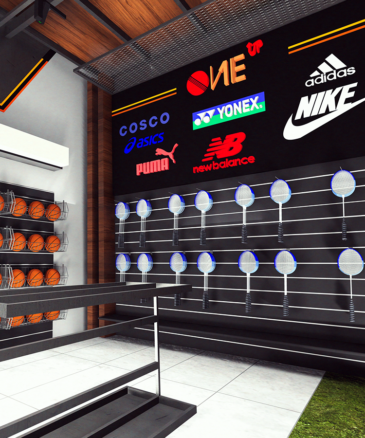
Signage is embedded into the façade itself — not as an afterthought, but as a core identity.
- Night Visibility
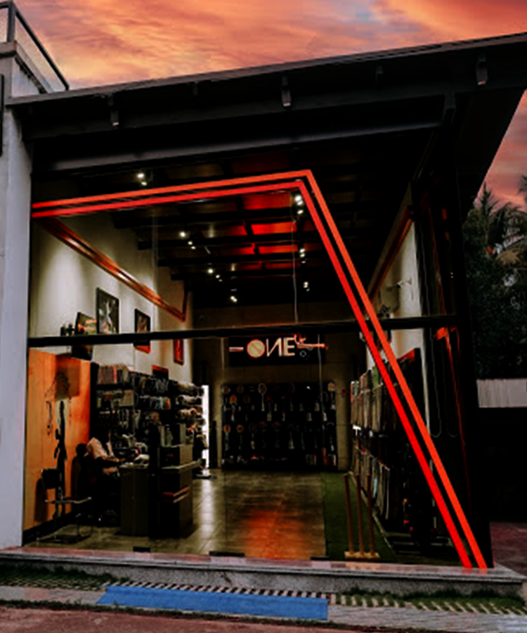
Thoughtfully placed lights ensure the brand shines even after hours.
Landscape Lighting
04
Backlit Branding Panel
The cricketer silhouette and number stay sharp and visible, day or night.
Glass Entry for Visibility
Street-facing glass connects the brand to the public, enhancing openness.
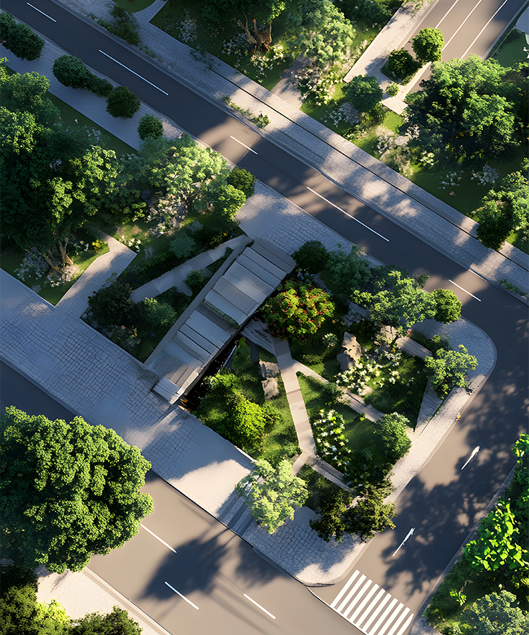
Framed Urban Edge
Angular pathways and textures give the site a structured urban identity.
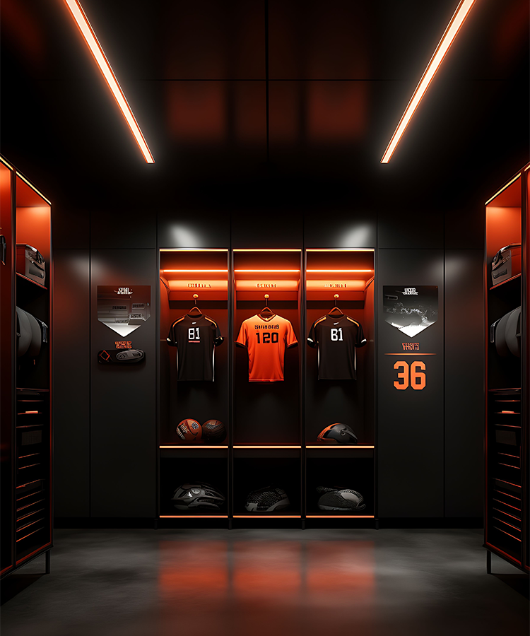
Accent Lighting with Motion Feel
Directional lights highlight movement and depth across the bold façade.

Testimonial
05
What This Project Means to Us
06
ONE UP is more than a building — it’s a brand in physical form. At Vairam Infra Build, this project allowed us to turn sport, speed, and ambition into a permanent, visual identity. Every element — steel, red, and light — was chosen to express strength in motion.
Enquiry
07
FAQ's
08
It’s a brand-forward retail structure designed for high visibility and engagement in an urban context.
The façade uses a mix of exposed concrete, blackened steel, and transparent glass — with bold red accents.
Yes. The signage and branding panels are fully backlit to ensure 24/7 visibility.
Definitely. This bold urban-industrial palette can suit gyms, showrooms, and even event spaces.